What makes a website ‘good’? When most people are asked this question, some simple answers might come up such as ‘easy to navigate’ but other than that, people tend to be stuck and ‘what makes a good business website' can be even trickier to define. Yet if they are on a site and they don’t like it, it doesn’t take long for them to quickly leave and search for another option. In the virtual world it’s the equivalent of a customer leaving your store. You don’t get the sale, you don’t get anything, and you need to work out why what you have built is not what people want to see, even if they can’t explain it themselves. These last few months at Dynamic Gift Canada we have been working on updating our website and we want to share some of the things we have learned, as well as the troubles we have encountered along the way.
Who is the site for? Knowing your target audience
If you were creating a restaurant that you want to appeal to millennials, then you wouldn’t fill it full of furniture from the 70s and line the walls with pictures of celebrities that they have never heard of – right? Creating a website holds the same principles. Before you design anything, you need to think about who you want to attract to your site and why. Then it’s time for that all-important research. Does anyone like doing it? Probably not. Does it help save time and help reduce mistakes in the long run? Absolutely yes. Without this you might produce a fantastic website that does nothing for you because the traffic it draws in is the wrong demographic for your cause.
How can I design my website for the end user? The elements of a good website
Something we found out about that we want to share is that part of what helps you rank more highly in search results is based on how well Google thinks your page will give their users the answers they need. For example, imagine you searched for ‘local dog walkers’ online but the link you clicked took you to a page about cat vacations instead – pretty bad answer to your question, right? It may sound extreme, but it could easily occur with a few mistakes in your page headings or image file names!

Then we have things like the UX, or user experience. Even if you are doing well for visibility that doesn’t mean your users are enjoying your site, so it’s far from the only thing that needs to be considered. This can be as simple as page composition – where did you place that checkout button and where should it be? If it’s hard to find, people won’t be buying from you, that’s for sure! It sounds obvious but with so much to think about when working on your site, it’s something that is easy to overlook or make mistakes on that can cost you sales.
Another thing we learned was the importance of making sure your UI, or user interface, is easy to navigate and enjoyable. Legible fonts, appropriately sized buttons and easy to use menus can make or break a sites popularity, whatever your intended audience. Asking for input from your team or staff with a variety of skill and experience levels can be a great way to find hidden problems when testing your site. Not to mention create a sleeker, more user-friendly result for your target audience!
Creating colour schemes and why they are so important
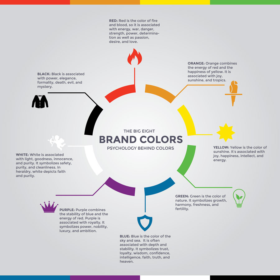
Picture a well known company in your mind. The chances are you are not thinking about their products or even just their name, but the colours associated with their brand. Or if we said ‘think of a store you know of that has an orange and white logo’ it would probably be pretty easy for you. This shows the importance of tying a colour scheme to your business and the same should be applied to your website too.
 Infographic by GraphicSprings
Chances are you already have a colour scheme in mind or even applied – but is it relevant to what you stand for? Think about ‘eco friendly’ products or companies, and how everything associated with them tends to have a green colour scheme. If you are looking to sell products that reduce anxiety or stress, then a vibrant orange and red site is probably not the way to go. Almost every colour has associated thoughts or feelings – choosing the right ones to represent you and your message is important. Align your colours to people's expectations and let it speak for you as much as the text you choose.
While we talk about text, we have learned that it’s important to use a text colour people are used to. You wouldn’t want to read a book full of bright blue or lime green print because it’s distracting (and also quite ugly) but some people fall into the trap of wanting their text to ‘pop’ or be different. We can’t speak for everyone, but we think there are much better ways to make yourself stand out without making your customers’ eyes water, so keeping within the colours and tones they are used to is important for ease of use and legibility.
And finally, how much colour is too much? That depends. Saturating your page can be another distraction, so we decided to focus the colours more on our banners and images and keep the rest clean and simple. You don’t want a stark page because that may look unfinished and unappealing, so to find a balance you could always ask for opinions or feedback from people not involved – it could help get things just right for when those customers and visitors start to use it!
Keeping it relevant – adding informative, accurate and enticing content
Those kittens in sweaters might look adorable, but do they have a place on your website? Do they add value? This sounds like common sense but it’s a trap many inexperienced creators can easily fall into. Just because it looks appealing to the creator doesn’t mean it has a place on your page. It has to be relevant and it has to keep the customer focused on what’s important to you. They might love that picture but while they are looking at that, they aren’t buying your supplies or being shown your best products which leads us to….
Too many pictures! This isn’t a family photo album and too many pictures can be overwhelming. Correctly showcasing your product matters. Few people want to read a solid block of text but too many pictures can slow down your site and become a distraction.
If you have products you want to show people, breaking them down into manageable, easy to view sections is a great way to balance interesting images and keep your viewer focused. We sell branded beer wrenches and custom printed tape measures – both are great, but chances are that our visitors aren’t looking for these items at the same time!
Another thing we discovered was the importance of being enticing and staying on track. Creating content that ‘leads people onwards’ is a great way of prolonging visits and giving the user a longer amount of time focused on your branding, even if they don’t buy anything – this time. The use of long and difficult words, or cold and unfriendly sentences can pull a person's focus from what they are reading – which is unfortunately an easy mistake to make. Keeping it simple to follow, interesting and informative is the way to go.
Providing quality images, without bloating your website
Without care and diligence, a website can become bloated and ‘website obesity’ can be problematic. Not every customer has the best internet speed and an overstuffed site can be slow and create frustration that causes people to leave. One of the leading causes of this is large images. It’s great if you have a professional grade camera but taking those images straight from the memory card to your website will give both you and your users a shock. Huge files uploaded directly to a site will increase load times and even cause potential customers to leave rather than wait to see the fantastic picture you added. Using the right settings, determined by your site and its needs, can go a long way to making a better experience for those who visit.
Make sure your images are clear and helpful to your customers! Again, this might sound like website building 101 but it’s something that can be overlooked and dismissed in favour of other focus points. Sure, the customer can identify that you are selling a purse, but that blurry quality diminishes the value of not only your site, but the product they are viewing. Don’t believe us? Take a moment later to visit any high end company and check out the astonishing clarity and detail of their photographs! The bottom line is that poor quality images means poor quality products from a poor quality company – at least in the eyes of a customer! So, we recommend working hard on those images and make sure they give you the definition you deserve, without slowing you down.
Looking good! Why improving your landing pages appearance matters
Firstly, what is a landing page? You might not know the term, but we all use them when we are on the web without being aware of it. A landing page is the page your visitor ‘lands on’ when they click a link to your site. This doesn’t mean it’s always the homepage, because every page on your site has something different to offer. If they are searching for water bottles and your company shows up then it should take them directly to that page, and it should be easy to tell that it’s a page about water bottles. This is why any page that your customer can visit has to look its best.
Making something informative and captivating can prolong interest and entice the visitor into reading further or learning more about you and your product. Then that visitor might contact you or make a purchase and they are no longer a browser surfing the web but your valued customer.
There are many ways to improve your landing pages, most of which are tied to your area of business (we wouldn’t want to give advice to people who specialize in gardening for example, because what works for us might not work for them!). However, a few key things to remember are:
- Keep information current
- Keep images current
- Make sure both are clear and accurate!
It’s funny because even those among us who aren’t the most computer savvy can quickly sniff out an out of date site. We believe it’s to do with the ever evolving brands and images we are exposed to on a daily, if subconscious basis. This gives many of us the ability to work out what’s dated or stale, the same way we recognize furniture and clothing styles from different decades. This means that keeping up with the times is important and information you might have learned about building a site, even a few years ago could not only be out of date but may be completely irrelevant.
Then you have your regular visitors, your loyal customers. A regular user of your site can quickly become accustomed to and even bored by a stale user interface, or UI. Keeping up to date, without sacrificing clarity is one of the cornerstones of a good website.
And finally, we want to wish you good luck!
Building our website has been fun but challenging and we might be finished for now, but times and styles are always moving forward, and we are committed to keeping up with them. We have learned from outside opinions and inhouse feedback. We have learned from both experts and novices on what they think makes a site ‘good’. Whatever you choose to do, we recommend research, a good time frame and above all – patience. Remember it’s all for the best in the long run because moving with the times, especially in the virtual world of today, matters in business.


